Jan 26

PHI109
CHI97
Final
WAS23
PHI55
Final

Jan 28

NJD28-17-6
PHI22-22-6
NBCSP @12:00 AM UTC

Jan 29

LAL25-18
PHI17-27
TNT @12:30 AM UTC

Jan 30

SAC23-22
PHI17-27
NBCSP @12:30 AM UTC
PHI22-22-6
NJD28-17-6
TNT @12:00 AM UTC

Ranking all 30 NBA City Edition uniforms

Share

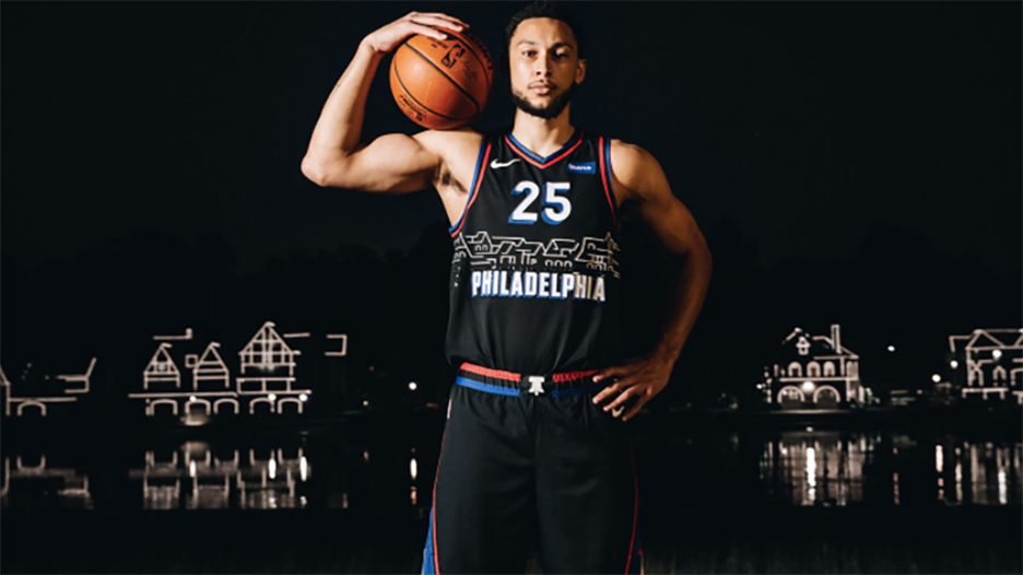
With the NBA season set to begin Tuesday night, we rank all of the new City Edition uniforms. By Dan Roche
31 photos
1/31
<p>Every NBA team will be wearing a new City Edition uniform this season, but which jerseys are best? We ranked all 30. </p>
Every NBA team will be wearing a new City Edition uniform this season, but which jerseys are best? We ranked all 30. 

2/31
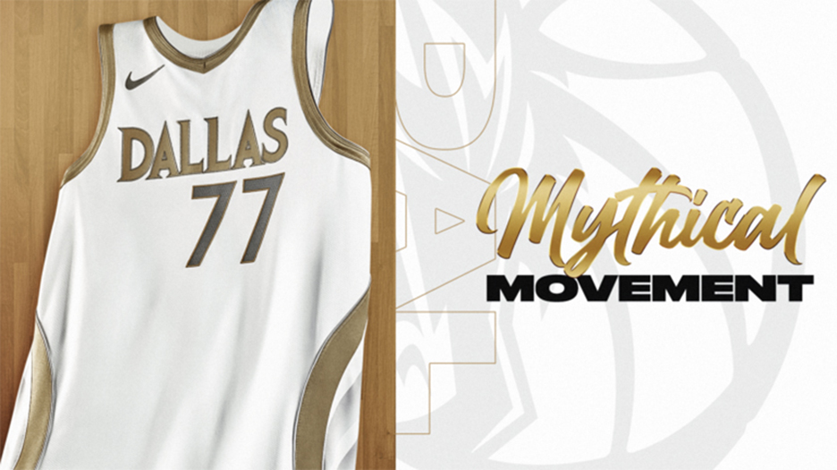
<p>I don’t have any idea what the Mavericks are trying to do here. They’ve been pretty consistently good with their uniforms over the years, but this looks like something someone thrown together at the last possible second.</p>

I don’t have any idea what the Mavericks are trying to do here. They’ve been pretty consistently good with their uniforms over the years, but this looks like something someone thrown together at the last possible second.
3/31
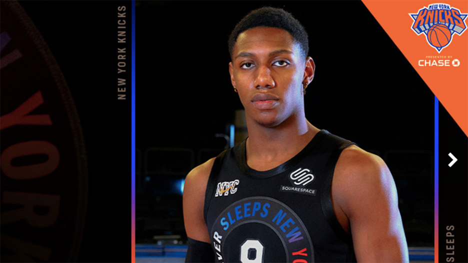
<p>My word. Nothing about this jersey looks good. From the no-trim collar to the shoehorning “City Never Sleeps” in, this stinks worse than a subway terminal.</p>

My word. Nothing about this jersey looks good. From the no-trim collar to the shoehorning “City Never Sleeps” in, this stinks worse than a subway terminal.
4/31
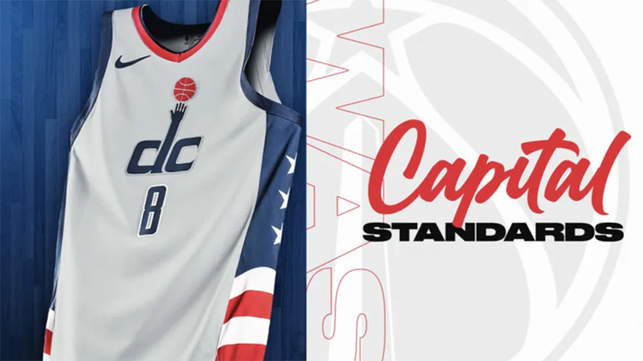
<p>Wow. Just in time for Russell Westbrook’s arrival, the Wiz roll out this awfulness. Aside from the fact that the logo is way too small, it looks more like “CLC” than “DC.”</p>

Wow. Just in time for Russell Westbrook’s arrival, the Wiz roll out this awfulness. Aside from the fact that the logo is way too small, it looks more like “CLC” than “DC.”
5/31
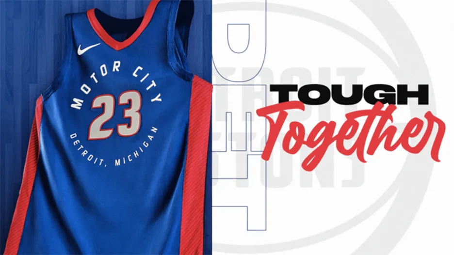
<p>No real departure from the original color scheme, and I fail to see why we have to put the city and the state on the jersey. Is there another Detroit in the NBA?</p>

No real departure from the original color scheme, and I fail to see why we have to put the city and the state on the jersey. Is there another Detroit in the NBA?
6/31
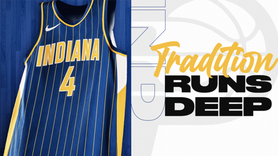
<p>I feel like the City jerseys are a chance for teams to go in a different direction. These are just throwback jerseys to when Rik Smits roamed the paint.</p>

I feel like the City jerseys are a chance for teams to go in a different direction. These are just throwback jerseys to when Rik Smits roamed the paint.

7/31
<p>This team always looked good in pinstripes, and I get the reason for the orange, but it just doesn’t fit for me.</p>

This team always looked good in pinstripes, and I get the reason for the orange, but it just doesn’t fit for me.
8/31
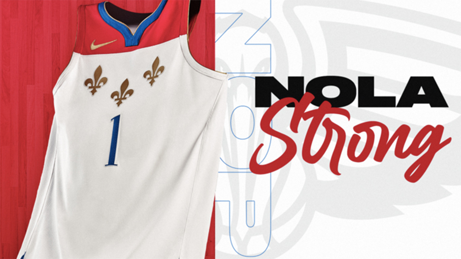
<p>You can’t tell me that this uniform doesn’t look like a pack of cigarettes.</p>

You can’t tell me that this uniform doesn’t look like a pack of cigarettes.
9/31
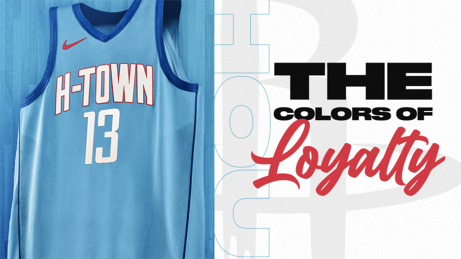
<p>Not a whole lot here. It's the “H-Town” look from last season’s City Editions in Houston Oilers blue.</p>

Not a whole lot here. It's the “H-Town” look from last season’s City Editions in Houston Oilers blue.
10/31
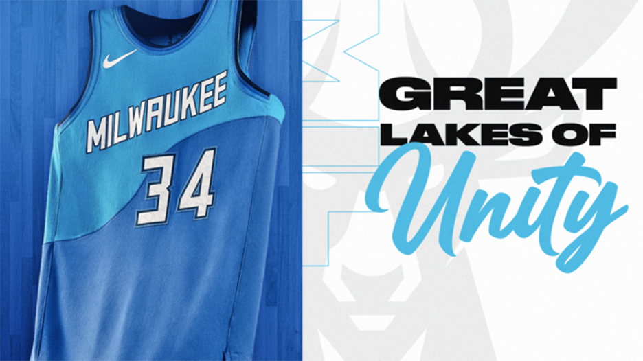
<p>Not bad, but not great. The blue is a different look, but they could’ve blended the colors better. It’s a way better look than the “Cream City” uniforms they trotted out last season.</p>

Not bad, but not great. The blue is a different look, but they could’ve blended the colors better. It’s a way better look than the “Cream City” uniforms they trotted out last season.
11/31
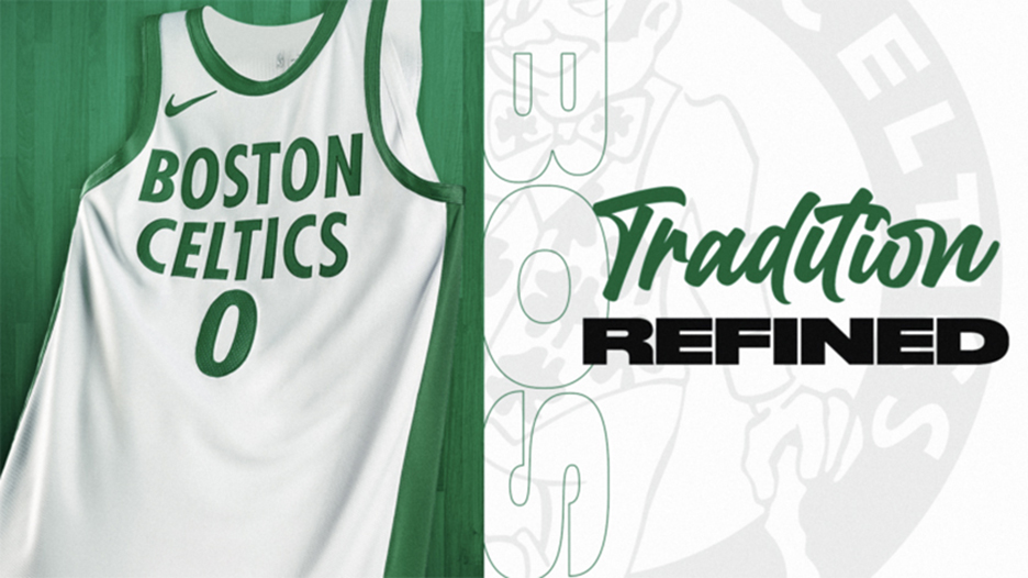
<p>The Celtics went for jerseys that look like the championship banners that hang at TD Garden. Just as blah as their originals.</p>

The Celtics went for jerseys that look like the championship banners that hang at TD Garden. Just as blah as their originals.
12/31
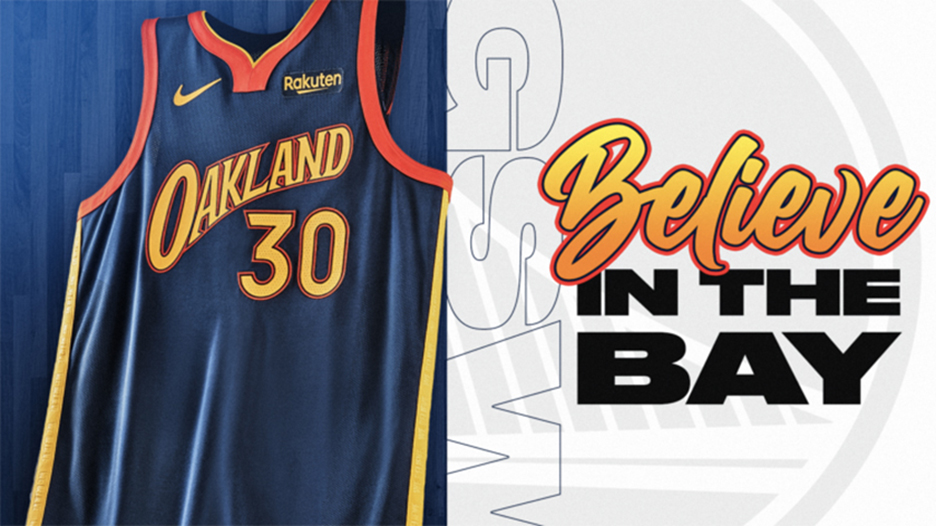
<p>A twist on a throwback, I like the use of “Oakland” on their Monta Ellis-era uniforms. They play in San Francisco now, but hey.</p>

A twist on a throwback, I like the use of “Oakland” on their Monta Ellis-era uniforms. They play in San Francisco now, but hey.
13/31
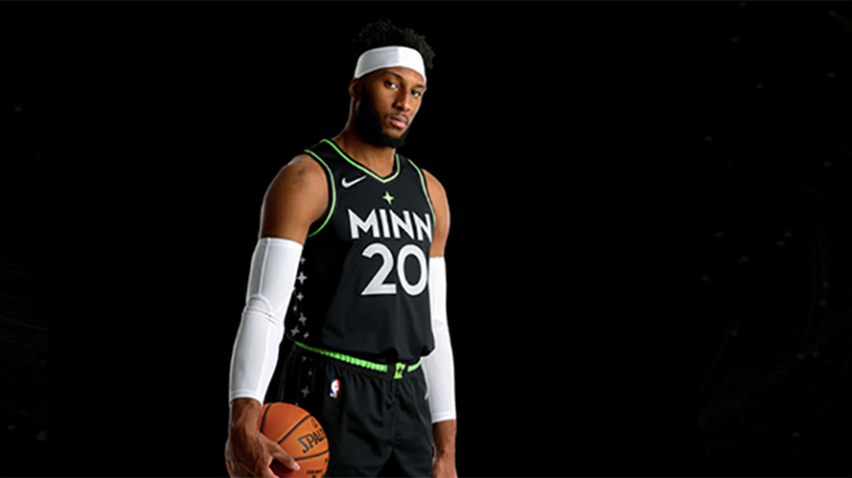
<p>Pretty basic, aside from the cool starry trim up one side. They’ll never top the Prince City Edition uniforms from last season.</p>

Pretty basic, aside from the cool starry trim up one side. They’ll never top the Prince City Edition uniforms from last season.
14/31
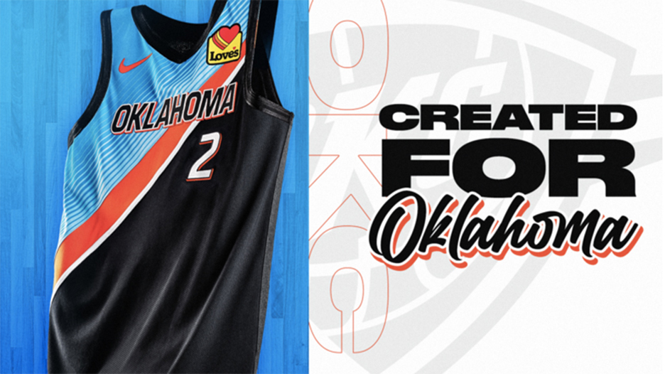
<p>So it’s just Oklahoma now? The design is cool, a big-time step away from their originals, but they’re “City” Edition jerseys for a reason.</p>

So it’s just Oklahoma now? The design is cool, a big-time step away from their originals, but they’re “City” Edition jerseys for a reason.
15/31
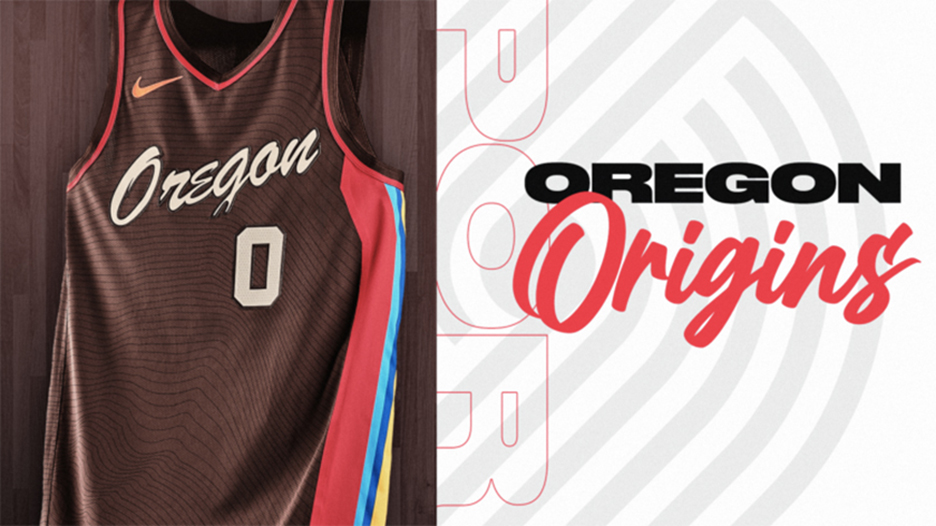
<p>Same deal, different team. Cool design, shoutout to the whole state.</p>

Same deal, different team. Cool design, shoutout to the whole state.
16/31
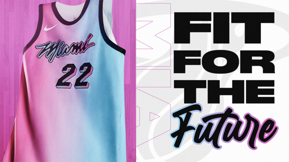
<p>I liked all the versions of their Miami Vice jerseys, but this one is just all of them mushed together.</p>

I liked all the versions of their Miami Vice jerseys, but this one is just all of them mushed together.
17/31
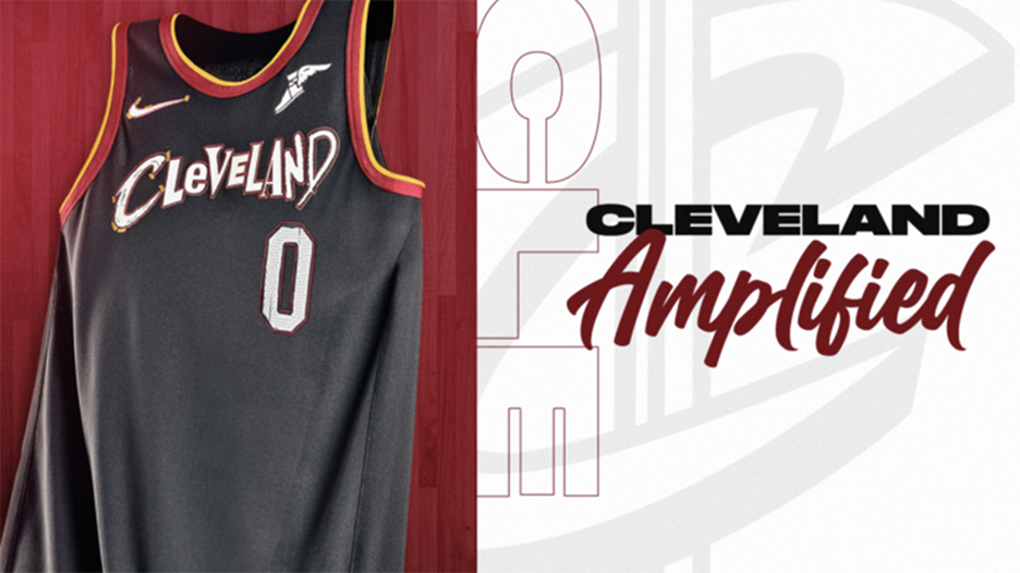
<p>I appreciate what they tried to do here with all the letters in Cleveland from fonts of Hall of Fame Rock bands. But I shouldn’t need a decoder ring to appreciate it. It looks like a ransom note.</p>

I appreciate what they tried to do here with all the letters in Cleveland from fonts of Hall of Fame Rock bands. But I shouldn’t need a decoder ring to appreciate it. It looks like a ransom note.
18/31
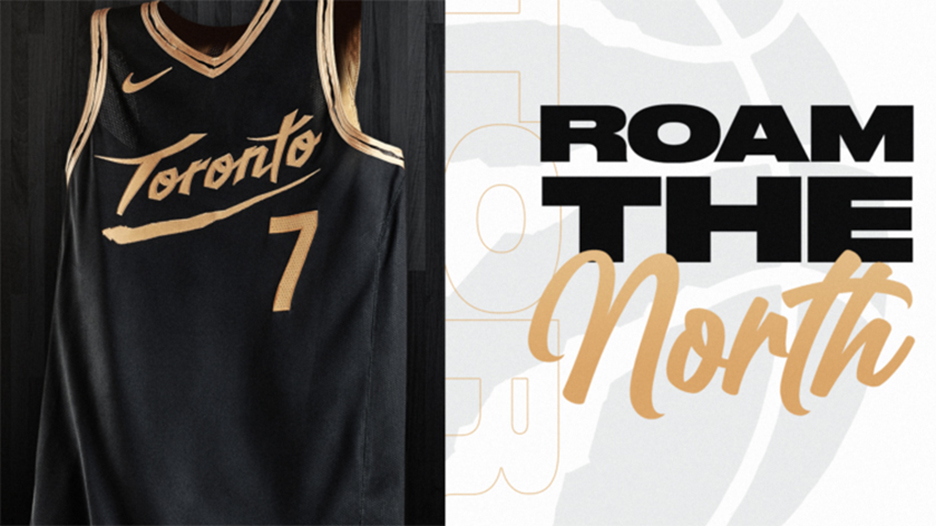
<p>They went with the same colorway from last year but with more dinosaur claw scratches. The black and gold is a slick look.</p>

They went with the same colorway from last year but with more dinosaur claw scratches. The black and gold is a slick look.
19/31
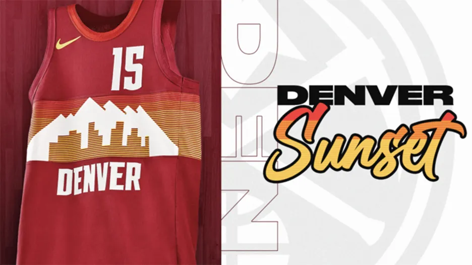
<p>The same strong design from last season, now on a red jersey.</p>

The same strong design from last season, now on a red jersey.
20/31
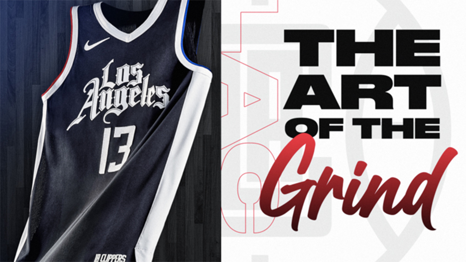
<p>I thought these were dynamite when they came out last season. The Clippers didn’t change them, so they take a hit in the rankings.</p>

I thought these were dynamite when they came out last season. The Clippers didn’t change them, so they take a hit in the rankings.
21/31
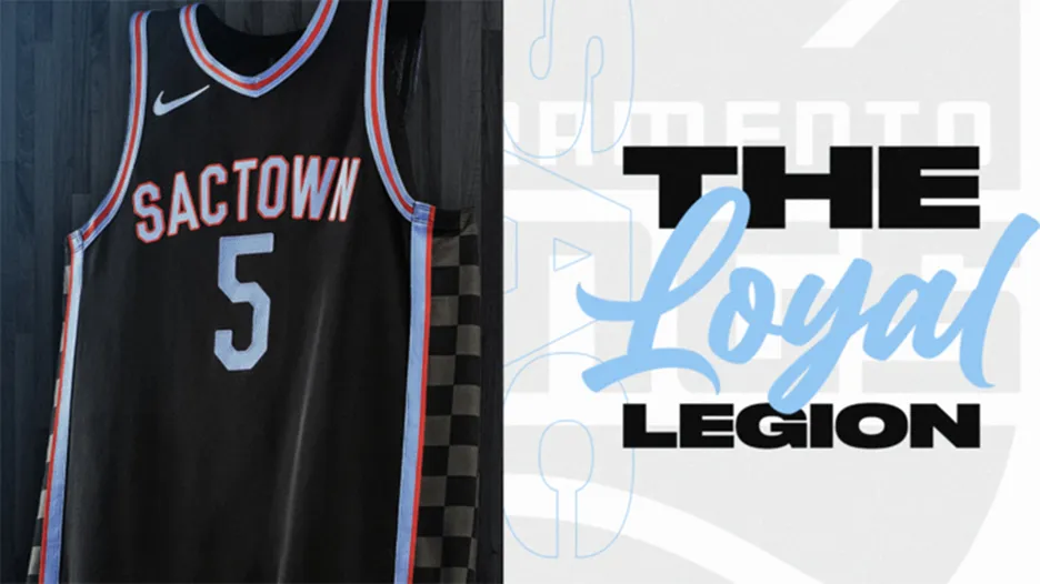
<p>The Kings really put their heart into this one. The baby blue on black pops and the red trim is nice as well.</p>

The Kings really put their heart into this one. The baby blue on black pops and the red trim is nice as well.
22/31
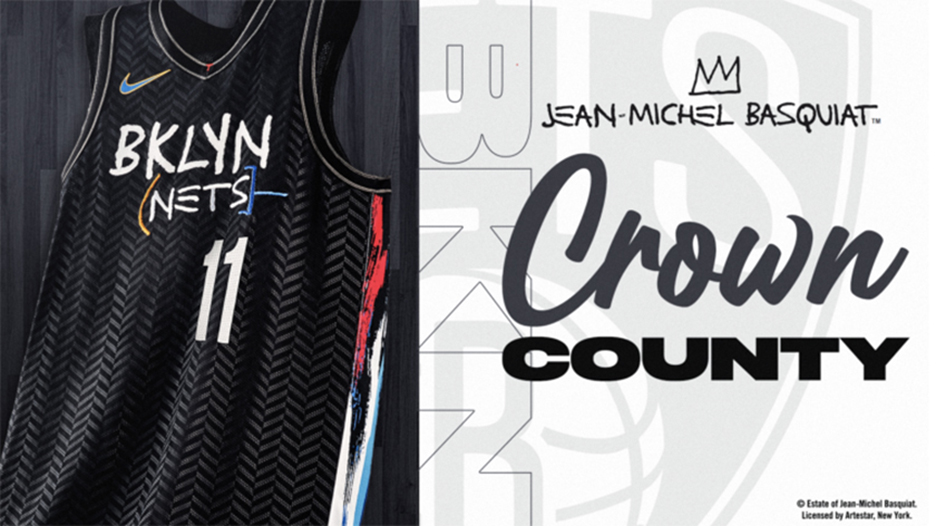
<p>A shoutout to Brooklyn-born artist Jean-Michel Basquiat, this screams “City” jersey to me. Well done.</p>

A shoutout to Brooklyn-born artist Jean-Michel Basquiat, this screams “City” jersey to me. Well done.
23/31
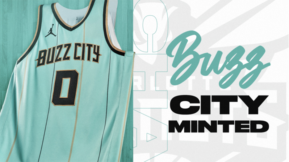
<p>I really like the colorway Charlotte went with. You never see teams wear mint green.</p>

I really like the colorway Charlotte went with. You never see teams wear mint green.
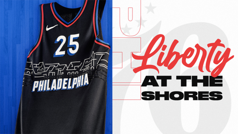
24/31
<p>Maybe I’m partial because I’m local, although I know I’m in the minority. Again, they’re “City” jerseys, and yeah, the Iverson-era jerseys would’ve been a cool callback, but that’s another fight.</p>

Maybe I’m partial because I’m local, although I know I’m in the minority. Again, they’re “City” jerseys, and yeah, the Iverson-era jerseys would’ve been a cool callback, but that’s another fight.
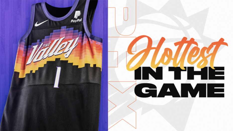
25/31
<p>Love the design on this one. Everything about this jersey says Phoenix to me. Well, except for the fact that it doesn’t say Phoenix anywhere on it.</p>

Love the design on this one. Everything about this jersey says Phoenix to me. Well, except for the fact that it doesn’t say Phoenix anywhere on it.
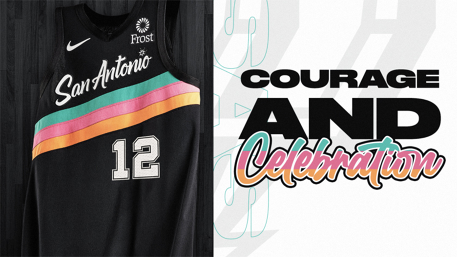
26/31
<p>Nice call bringing back the Fiesta colorway they used on their warmups during their dynasty in the 1990s. Just enough of a color splash to make it sing.</p>

Nice call bringing back the Fiesta colorway they used on their warmups during their dynasty in the 1990s. Just enough of a color splash to make it sing.
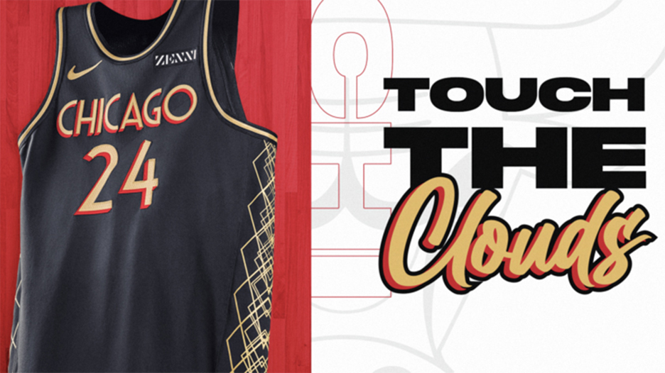
27/31
<p>Beautiful. The Bulls go Art Deco with their City Editions, from the jersey font to the trim up the sides, mimicking much of the architecture for the Second City.</p>

Beautiful. The Bulls go Art Deco with their City Editions, from the jersey font to the trim up the sides, mimicking much of the architecture for the Second City.
28/31
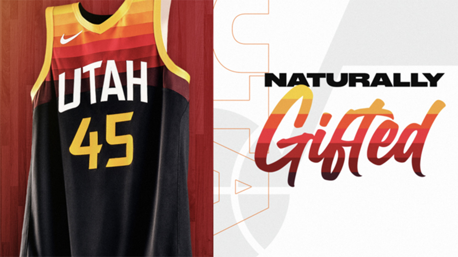
<p>Liked their City Editions last year, love them this year. A gradient fade to black just works.</p>

Liked their City Editions last year, love them this year. A gradient fade to black just works.

29/31
<p>Tough to mess with one of the most iconic uniforms in sports, but this colorway is dope.</p>

Tough to mess with one of the most iconic uniforms in sports, but this colorway is dope.
30/31
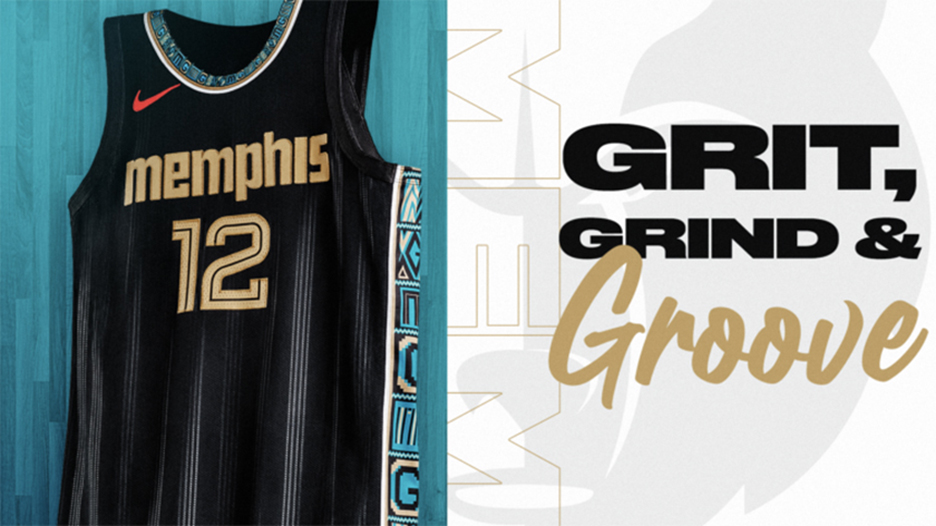
<p>So many cool elements to this jersey, which illustrates Memphis’ own Stax Records and its most influential artist, Isaac Hayes. The Memphis wordmark is the same font as the Stax logo, all the way down to the record grooves in the background.</p>

So many cool elements to this jersey, which illustrates Memphis’ own Stax Records and its most influential artist, Isaac Hayes. The Memphis wordmark is the same font as the Stax logo, all the way down to the record grooves in the background.
31/31
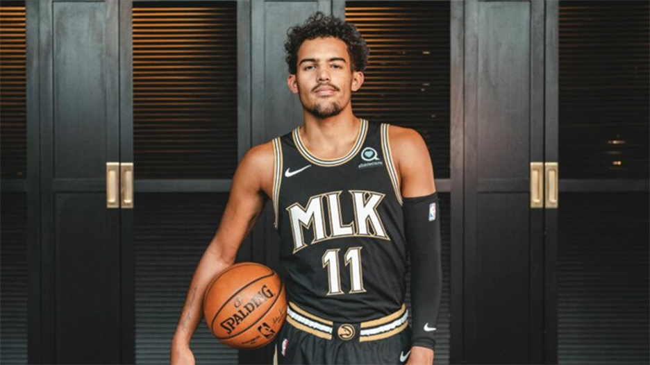
<p>The Hawks do a fantastic job here, collaborating with the estate of civil rights icon and Atlanta native Dr. Martin Luther King, Jr. for these truly unique, powerful uniforms.</p>

The Hawks do a fantastic job here, collaborating with the estate of civil rights icon and Atlanta native Dr. Martin Luther King, Jr. for these truly unique, powerful uniforms.

Contact Us